Printing Processes & Techniques Part 2
This article is the second in a series on printing processes and terminology. be sure you don't miss our first post: The Different Types of Printing Methods & What They Mean

In the last blog, we discussed the most common methods of printing, such as offset printing and digital printing, as well as their common uses. In this post we are taking a look at a few other main printing processes and terms that are good to know.
From embossing to fluorescent inks, these techniques can add extra visual spark and splendour to your printing project. Whether you are trying to make an impression with your marketing materials or create a wedding invitation that looks timeless, these techniques can help.
Emboss Stamping
The process of emboss stamping (or embossing) is a process that creates a slightly raised image on the paper or print medium. An embossed image is one that is raised against the background of the paper in slight three-dimensional relief. Using heat, pressure, and die sets, printers can create the crisp 3D texture that embossing demands.
Emboss stamping starts with two stamping dies, which are virtually exact opposites of one another. One die features the raised image that you wish to emboss onto the print medium; the second is recessed, mapping out the negative space around the image to be embossed. These two dies fit together into one cohesive set. When you press them together in the embossing process, the raised die pushes part of the print medium into the recessed die, creating the slightly raised image.
In all likelihood, you see the results of emboss stamping every day. The raised numbers on your credit cards are the product of an embossing process, as are the raised numbers on your car's license plate. However, this type of printing can also be performed on virtually any type of printing medium and for a wide variety of different uses. From fancy envelopes to wedding invitations, emboss stamping is often used to portray elegance.
Gold Foil Finishing
Another elegant printing option is gold foil finishing. Usually, this process is paired with embossing. The die stamps create the impression in the paper or another print medium. Simultaneously, the heated stamp adds a thin finish of gold foil to the paper. The heat and pressure of the embossing process make it possible for the foil to fuse seamlessly with the paper. The gold foil finishing then adds an extra visual spark to the texture of the relief stamp. Again, this process is particularly popular for wedding invitations and engagement announcements.
UV Coating
Used quite frequently for printed marketing materials, UV coating is a process that adds new professionalism to printed projects. By adding UV coating to a printing project, you can get a shinier, glossier look. The process also adds extra thickness to the finished product, which helps with durability.
Essentially, UV coating is the process of applying a glossy coating to paper stock and then drying it rapidly with blasts of UV light. Several different compounds can be used in this process to create the coating—some of which are shinier or thicker than others. When a printing project requires you to choose between high-gloss, medium-gloss, and matte finishes, you are dealing with UV coating. And indeed, UV coating is everywhere, from postcards to paperback book covers to marketing materials and beyond.
Pantone Matching System
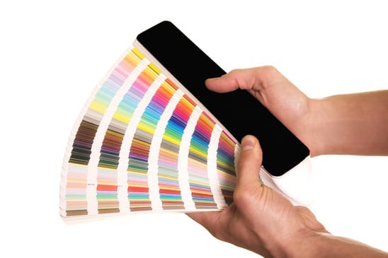
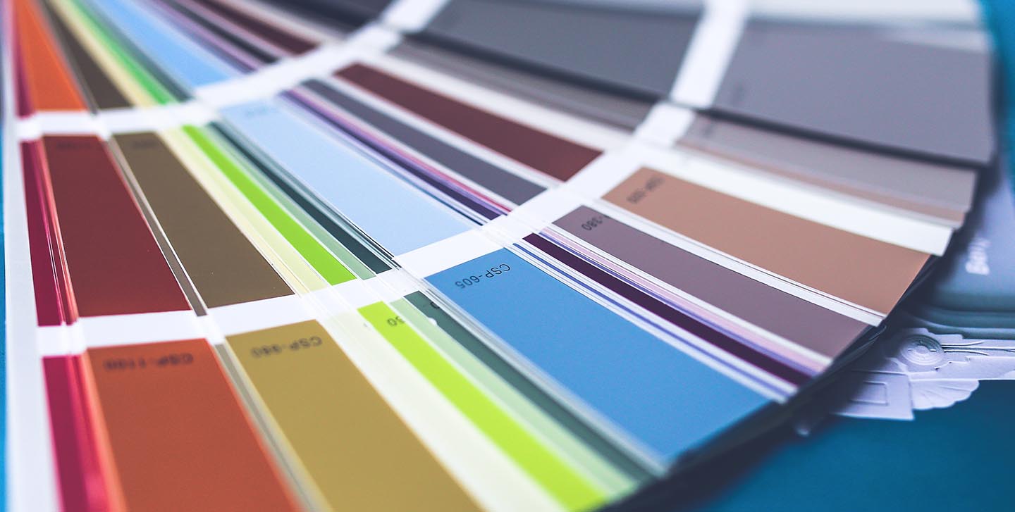
The Pantone Matching System is a widely used system for the standardisation of printing colours. Pantone's system is not the only colour standardisation system used in printing, but it is likely the most well known. The Pantone Matching System is most commonly utilised in printing, but it also has applications in the creation of other coloured products—including paints, fabrics, plastics, and more. In printing, the Pantone Matching System is useful for getting consistent colour shades with every print job. The vast majority of printers use and understand the Pantone Printing System.
How come the Pantone Printing System is useful? Consider this: graphic designers often find that their materials look different in physical format than they did on a high-resolution monitor. Specifically, the colours don't match exactly. The Pantone Matching System helps to minimize these differences. It also contributes to ensuring that colours are standard across multiple printing projects. So if the aforementioned graphic designer creates a logo that is then printed on letterheads, envelopes, marketing materials, business cards, and more, the Pantone Matching System helps to guarantee that the logo looks the same across the board.
Spot Colours
Spot colours and the Pantone Printing System are interconnected. According to Pantone, any colours “created without screens and dots” are known as “spot” or “solid” colours. These colours are the ones that are contained within the Pantone Matching System. To create the matching system, Pantone had to create unique ink mixing formulas for a huge variety of colours. These colour combinations and the colours they create are spot colours. Pantone creates their colours using 18 basic colours and has a classification system that labels each colour as either a C (for used on coated paper) or U (for use on uncoated paper).
Spot colours are different from process colours, which are colours created using a standard CMYK four-colour process. Most consumer printers don't have 18 colours to mix, as the Pantone Matching System suggests. Instead, these printers tend to have four standard ink colours: Cyan (C), Magenta (M), Yellow (Y), and Black (K). Using percentages of each of these inks—as well as collections of dots to provide a “tint”—the four-colour process can recreate many Pantone spot colours. In spot colour printing, every colour needs its own lithographic film; in process printing, the tinting process removes this expense.
Fluorescent Inks
Fluorescent inks (or “fluoro inks,” as they are sometimes called in the industry) are precisely what they sound like special inks that create an otherworldly fluorescent look. Fluorescent inks look brighter than standard ink colours and can allow an image to “leap off the page” in a striking and pleasing way. Companies like Pantone, create fluorescent Cyan, Magenta, and Yellow inks that can be used to create this unique look. Alternatively, you can mix fluorescent inks with process colour inks for a more balanced aesthetic. In any case, fluorescent inks merely have pigments that absorb more UV energy and transmit it back as longer visible waves.
Have we missed something?
Is there a printing process we have missed in either this article or part 1?
If you notice there's something we've missed, please let us know in the comments so we can add it here in the post 🙂


